ThriveCart Learn provides course creators with versatile options to present their content effectively. One key aspect is choosing the right layout and ensuring your visuals, especially cover images and thumbnails, are perfectly sized for optimal display. Let’s explore the different layouts ThriveCart Learn offers and how to make the most of your “cover size” to enhance the student experience.
ThriveCart Learn offers three primary layouts, each designed to cater to different course content styles and creator preferences: Sidebar, Top Menu, and Grid. Each layout is unique to the course, allowing for a personalized learning environment across your offerings. Remember, while these are default styles, ThriveCart Learn is highly customizable, letting you tailor colors and content to align with your brand. You can also enhance your lessons and modules with images, which act as thumbnails within these layouts.
Exploring ThriveCart Learn Layouts
Let’s delve into each layout to understand their features and how they impact visual presentation.
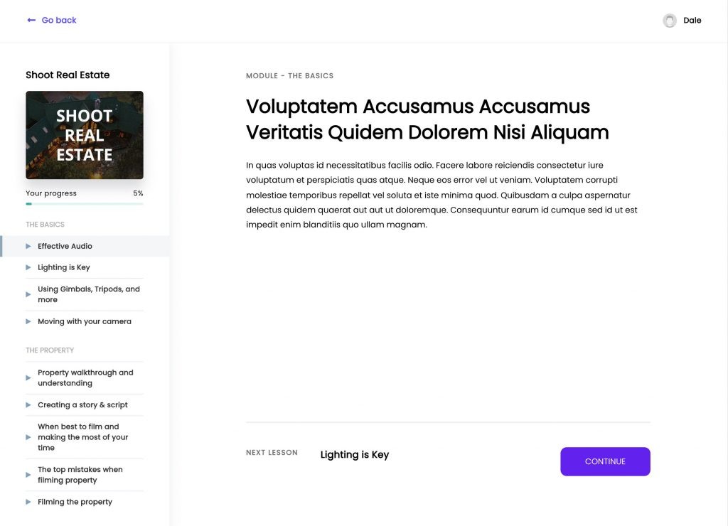
The Sidebar Layout
The Sidebar layout refines the classic sidebar navigation, presenting modules and lessons in an adjustable-width sidebar. Its full-color customization allows for brand integration, and lesson completion indicators provide students with clear progress tracking. The main lesson area utilizes a drag-and-drop editor for easy content addition, supporting text, images, embedded videos, and more. Thumbnails for lessons and modules are also displayed within the sidebar, enhancing visual navigation.
The Top Menu Layout
For creators prioritizing lesson content focus, the Top Menu layout is ideal. It eliminates the sidebar, placing navigation within a top menu. Students navigate using a bottom content button or the header dropdown menu for module and lesson access. This layout is streamlined and minimizes distractions, perfect for content-heavy courses. Lesson and module thumbnails appear in the dropdown menu, adding visual cues without cluttering the main content area.
The Grid (Page) Layout
The Grid layout offers a visually rich, multi-level structure.
This layout presents a customizable page where you arrange course modules in a grid format. It strongly encourages thumbnail usage for a visually immersive experience. Clicking a module leads to a module overview page listing its lessons. This visual approach is excellent for courses with distinct modules that benefit from strong visual differentiation.
Upon selecting a lesson within the Grid layout, students access a focused lesson page, similar to the Top Menu layout, ensuring minimal distractions. This multi-tiered approach combines visual appeal with focused lesson delivery.
Optimizing Thumbnail & “Cover Size” in ThriveCart Learn
ThriveCart Learn’s layouts benefit significantly from well-chosen and appropriately sized thumbnails. While the term “cover size” isn’t explicitly used, it refers to the dimensions of these visual elements that act as course and module “covers”.
For optimal visual quality across layouts, ThriveCart Learn recommends a thumbnail size of 1280×960 pixels. The platform automatically scales and optimizes images, but starting with this size ensures your visuals remain sharp and clear on different devices and screen sizes. Using consistent and high-quality thumbnails contributes to a professional and engaging learning environment, enhancing your brand and student perception.
Examples of Layouts with Thumbnails
ThriveCart Learn’s flexibility extends to how you incorporate thumbnails and other elements to create engaging course pages.
The Grid layout example showcases a customized course page with a header, course title, video introduction, and a link to a community forum, all positioned above visually appealing module thumbnails. This demonstrates how you can personalize the layout beyond just module presentation.
Module pages themselves are also customizable. This example features a module introduction video, lesson thumbnails, and an FAQ section, showing the potential to create rich, informative module overviews within ThriveCart Learn.
Lesson thumbnails, when added, appear not only in grid layouts but also in dropdown menus within the Top Menu layout, providing visual consistency across navigation styles.
Similarly, the Sidebar layout incorporates lesson thumbnails, further enhancing visual navigation and student engagement.
Conclusion
ThriveCart Learn empowers you with diverse and adaptable layouts to showcase your course content effectively. Understanding the strengths of Sidebar, Top Menu, and Grid layouts, and optimizing your thumbnail “cover size” using the recommended 1280×960 dimensions, are key to creating visually appealing and user-friendly online courses. With full-color customization and drag-and-drop editors, ThriveCart Learn provides the tools to build a branded and engaging learning experience for your students.