Are Pivot Tables Easy To Learn? Absolutely! Pivot tables are powerful tools for data analysis, and mastering them can significantly enhance your analytical skills. This comprehensive guide from LEARNS.EDU.VN breaks down pivot tables into easily digestible concepts, offering a clear path to proficiency. By the end, you’ll transform raw data into actionable insights, boosting your data storytelling capabilities. Dive in to explore data summarization techniques and unlock the potential of data manipulation.
1. Understanding Pivot Tables: The Basics
A pivot table is a powerful tool used to summarize, sort, reorganize, group, count, total, or average data stored in a table. It allows you to transform columns into rows and vice versa, group data by any field, and perform advanced calculations. Think of it as a dynamic way to slice and dice your data to reveal hidden patterns and trends. Pivot tables can quickly answer critical business questions, making information easy to understand and interpret.
1.1. What is the Purpose of a Pivot Table?
The primary use of a pivot table is to take large datasets and condense them into meaningful summaries. Instead of sifting through countless rows of data, you can use a pivot table to extract specific information and present it in a clear, concise format. According to Exceljet, pivot tables are useful for identifying unique values, spotting typos, and revealing inconsistencies in your data. This is incredibly useful for data cleaning and validation.
1.2. Practical Examples of Pivot Table Applications
To illustrate the usefulness of pivot tables, consider these practical examples:
- Sales Analysis: Determine which products are selling best in each region.
- Marketing Campaigns: Analyze which marketing channels are generating the most leads.
- Inventory Management: Identify which items are overstocked or understocked.
- Customer Segmentation: Group customers based on purchase behavior.
- Financial Reporting: Summarize financial data to create income statements or balance sheets.
1.3. Core Functionalities of Pivot Tables
Pivot tables perform several core functions that simplify data analysis:
- Grouping: Grouping items/records/rows into categories.
- Counting: Counting the number of items in each category.
- Summing: Summing the values of items in each category.
- Averaging: Computing the average value of items in each category.
- Finding Min/Max: Identifying the minimum or maximum value in each category.
2. The 52-Card Deck Analogy: A Simple Introduction
To understand how pivot tables work, let’s start with a simple analogy: a standard deck of 52 playing cards. Each card has attributes: symbol (clubs ♣, diamonds ♦, hearts ♥, spades ♠), value (A, 1 through 10, J, Q, K), and color (black or red).
🂡🂢🂣🂤🂥🂦🂧🂨🂩🂪🂫🂭🂮 🂱🂲🂳🂴🂵🂶🂷🂸🂹🂺🂻🂽🂾 🃁🃂🃃🃄🃅🃆🃇🃈🃉🃊🃋🃍🃎 🃑🃒🃓🃔🃕🃖🃗🃘🃙🃚🃛🃝🃞
2.1. Grouping by Color: The First Pivot
Imagine grouping the deck by color:
| black | 🂡🂢🂣🂤🂥🂦🂧🂨🂩🂪🂫🂭🂮🃑🃒🃓🃔🃕🃖🃗🃘🃙🃚🃛🃝🃞 |
|---|---|
| red | 🂱🂲🂳🂴🂵🂶🂷🂸🂹🂺🂻🂽🂾🃁🃂🃃🃄🃅🃆🃇🃈🃉🃊🃋🃍🃎 |
By counting the cards in each category, we get:
| black | 26 |
|---|---|
| red | 26 |
In this simple pivot table, “black” and “red” are the Row Labels. The computer does the counting for us, so we see only the numbers.
2.2. Rotating the Table: Column Labels
If we turn the table 90 degrees clockwise, we get:
| black | red |
|---|---|
| 26 | 26 |
Now, “black” and “red” are the Column Labels. Whether you use Row Labels or Column Labels is a matter of preference, but both present the same information.
2.3. Adding Another Dimension: Grouping by Symbol
We can further divide the deck by symbol:
| clubs ♣ | 🃑🃒🃓🃔🃕🃖🃗🃘🃙🃚🃛🃝🃞 |
|---|---|
| diamonds ♦ | 🃁🃂🃃🃄🃅🃆🃇🃈🃉🃊🃋🃍🃎 |
| hearts ♥ | 🂱🂲🂳🂴🂵🂶🂷🂸🂹🂺🂻🂽🂾 |
| spades ♠ | 🂡🂢🂣🂤🂥🂦🂧🂨🂩🂪🂫🂭🂮 |
Counting the cards, we find:
| clubs ♣ | 13 |
|---|---|
| diamonds ♦ | 13 |
| hearts ♥ | 13 |
| spades ♠ | 13 |
2.4. Combining Properties: Two-Dimensional Pivot Table
Now, let’s combine color and symbol:
| red | black | |
|---|---|---|
| clubs ♣ | 13 | |
| diamonds ♦ | 13 | |
| hearts ♥ | 13 | |
| spades ♠ | 13 |
Here, card symbols are Row Labels, and color is the Column Label.
2.5. Interpreting the Results
This table shows that there are no red clubs, black diamonds, black hearts, or red spades. This simple pivot table reveals that diamonds and hearts are always red, while clubs and spades are always black.
3. Advanced Pivot Table Concepts
Beyond the basics, pivot tables offer advanced features that enhance their analytical power.
3.1. Rotation and Multi-Level Labels
Pivot tables allow various rotations and arrangements of Row and Column Labels. The key is to choose the representation that best communicates your data story.
- Rotation:
| clubs ♣ | diamonds ♦ | hearts ♥ | spades ♠ |
|---|---|---|---|
| black | 13 | ||
| red | 13 | 13 |
- Multi-level Row Labels:
| black | clubs ♣ | 13 |
|---|---|---|
| spades ♠ | 13 | |
| red | diamonds ♦ | 13 |
| hearts ♥ | 13 |
- Multi-level Column Labels:
| | red | black |
|—|—|—|—|—|—|—|—|
| clubs ♣ | diamonds ♦ | hearts ♥ | spades ♠ | clubs ♣ | diamonds ♦ | hearts ♥ | spades ♠ |
| 13 | | 13 | | | 13 | | 13 |
3.2. Sums and Percentages
Adding totals in rows and columns provides additional insights.
| red | black | Row Total | |
|---|---|---|---|
| clubs ♣ | 13 | 13 | |
| diamonds ♦ | 13 | 13 | |
| hearts ♥ | 13 | 13 | |
| spades ♠ | 13 | 13 | |
| Column Total | 26 | 26 | 52 |
It’s important to note that Column Totals count all the cards (52) as well as Row Totals (52). Columns and rows represent different categories.
3.3. Relative Values and Percentages
You can also display values as percentages:
| red | black | Row Total | |
|---|---|---|---|
| clubs ♣ | 25% | 25% | |
| diamonds ♦ | 25% | 25% | |
| hearts ♥ | 25% | 25% | |
| spades ♠ | 25% | 25% | |
| Column Total | 50% | 50% | 100% |
This table shows that half the cards are red, half are black, and each symbol represents a quarter of all cards.
4. Pivot Tables in Business: A Pizza Restaurant Example
To make pivot tables more relatable, let’s use a business example: a pizza restaurant.
4.1. Tabularizing the Data
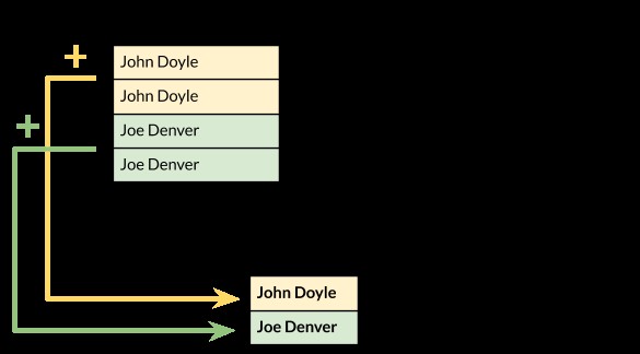
To analyze data with pivot tables, you must first organize it into a table. Each row represents a transaction or event.
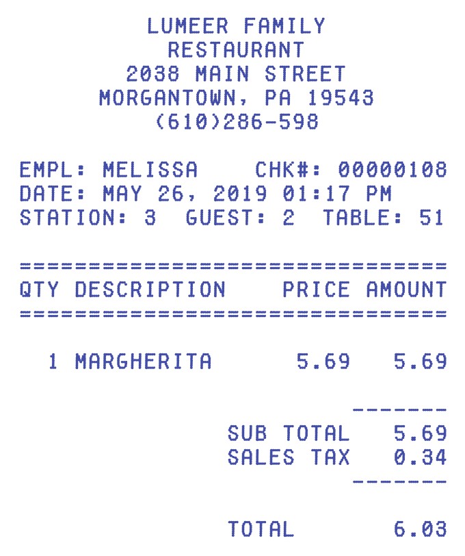
Consider a pizza receipt:
The key properties of this receipt are:
- Employee serving the table
- Date and time of the transaction
- Goods sold (e.g., pizza Margherita)
- Price, tax, total
We can tabularize this information as follows:
| Employee | Date and Time | Pizza | Total |
|---|---|---|---|
| Melissa | 2019/05/26 01:17PM | Margherita | $6.03 |
Tracking multiple receipts yields the following table:
| Employee | Date and Time | Pizza | Total |
|---|---|---|---|
| Melissa | 2019/05/26 01:17PM | Margherita | $6.03 |
| Sylvia | 2019/05/27 01:19PM | Quattro Stagioni | $6.74 |
| Juliette | 2019/05/28 02:23PM | Salami | $6.38 |
| Melissa | 2019/05/29 02:36PM | Tuna | $6.91 |
| Sylvia | 2019/06/01 02:41PM | Margherita | $6.03 |
| Juliette | 2019/06/10 02:49PM | Quattro Stagioni | $6.74 |
| Melissa | 2019/06/11 02:57PM | Salami | $6.38 |
| Sylvia | 2019/06/12 03:01PM | Tuna | $6.91 |
| Juliette | 2019/06/26 03:02PM | Margherita | $6.03 |
| Sylvia | 2019/07/16 03:11PM | Quattro Stagioni | $6.74 |
| Juliette | 2019/07/17 03:26PM | Salami | $6.38 |
| Melissa | 2019/07/18 03:28PM | Tuna | $6.91 |
| Sylvia | 2019/07/19 03:31PM | Quattro Stagioni | $6.74 |
4.2. Questions to Answer with Pivot Tables
With this data, we can answer several business-critical questions:
- Who sold how many pizzas?
- Which type of pizza was sold how many times?
- Who generated what revenue (total value of pizzas sold)?
- What pizza generated what revenue?
- What type of pizzas are sold most in a given month or season?
- What type of pizzas are better sold in the morning and in the afternoon?
4.3. Who Sold How Many Pizzas?
The Row Label is “Employee”. The Summation Value is a count of “Pizza”.
| Employee | Pizzas Count |
|---|---|
| Melissa | 4 |
| Sylvia | 5 |
| Juliette | 4 |
4.4. Which Type of Pizza Was Sold How Many Times?
The Row Label is “Pizza”. The Summation Value is a count of “Pizza”.
| Pizza | Pizzas Count |
|---|---|
| Margherita | 3 |
| Quattro Stagioni | 4 |
| Salami | 3 |
| Tuna | 3 |
4.5. Who Generated What Revenue?
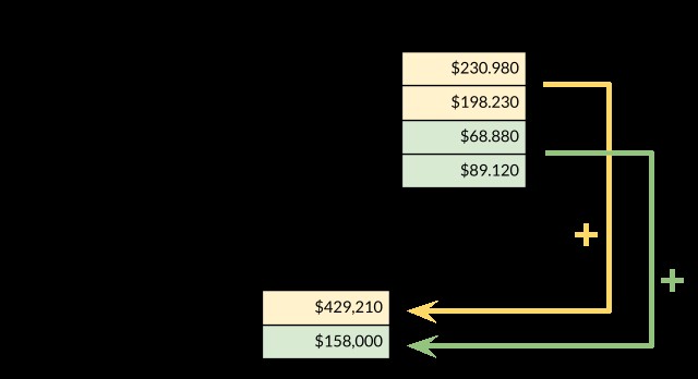
The Row Label is “Employee”. The Summation Value is the sum of the “Total” column.
| Employee | Sum of Total |
|---|---|
| Melissa | $26.23 |
| Sylvia | $33.16 |
| Juliette | $25.53 |
4.6. What Pizza Generated What Revenue?
The Row Label is “Pizza”. The Summation Value is the sum of the “Total” column.
| Pizza | Sum of Total |
|---|---|
| Margherita | $18.09 |
| Quattro Stagioni | $26.96 |
| Salami | $19.14 |
| Tuna | $20.73 |
| Grand Total | $84.92 |
Displaying this as percentages:
| Pizza | % of Total |
|---|---|
| Margherita | 21.30% |
| Quattro Stagioni | 31.75% |
| Salami | 22.54% |
| Tuna | 24.41% |
| Grand Total | 100% |
5. Advanced Pizza Pivot Analysis
5.1. Sales by Month
To analyze pizza sales by month, you need to extract the month from the “Date and Time” column.
| Pizza / Month | May | June | July |
|---|---|---|---|
| Margherita | 1 | 2 | 0 |
| Quattro Stagioni | 1 | 1 | 2 |
| Salami | 1 | 1 | 1 |
| Tuna | 1 | 1 | 1 |
5.2. Sales by Time of Day
Similarly, analyze sales by the hour of the day:
| Pizza / Time | 1PM | 2PM | 3PM |
|---|---|---|---|
| Margherita | 1 | 1 | 1 |
| Quattro Stagioni | 1 | 1 | 2 |
| Salami | 0 | 2 | 1 |
| Tuna | 0 | 1 | 2 |
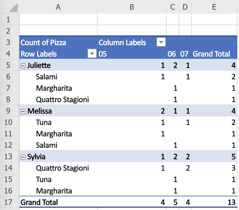
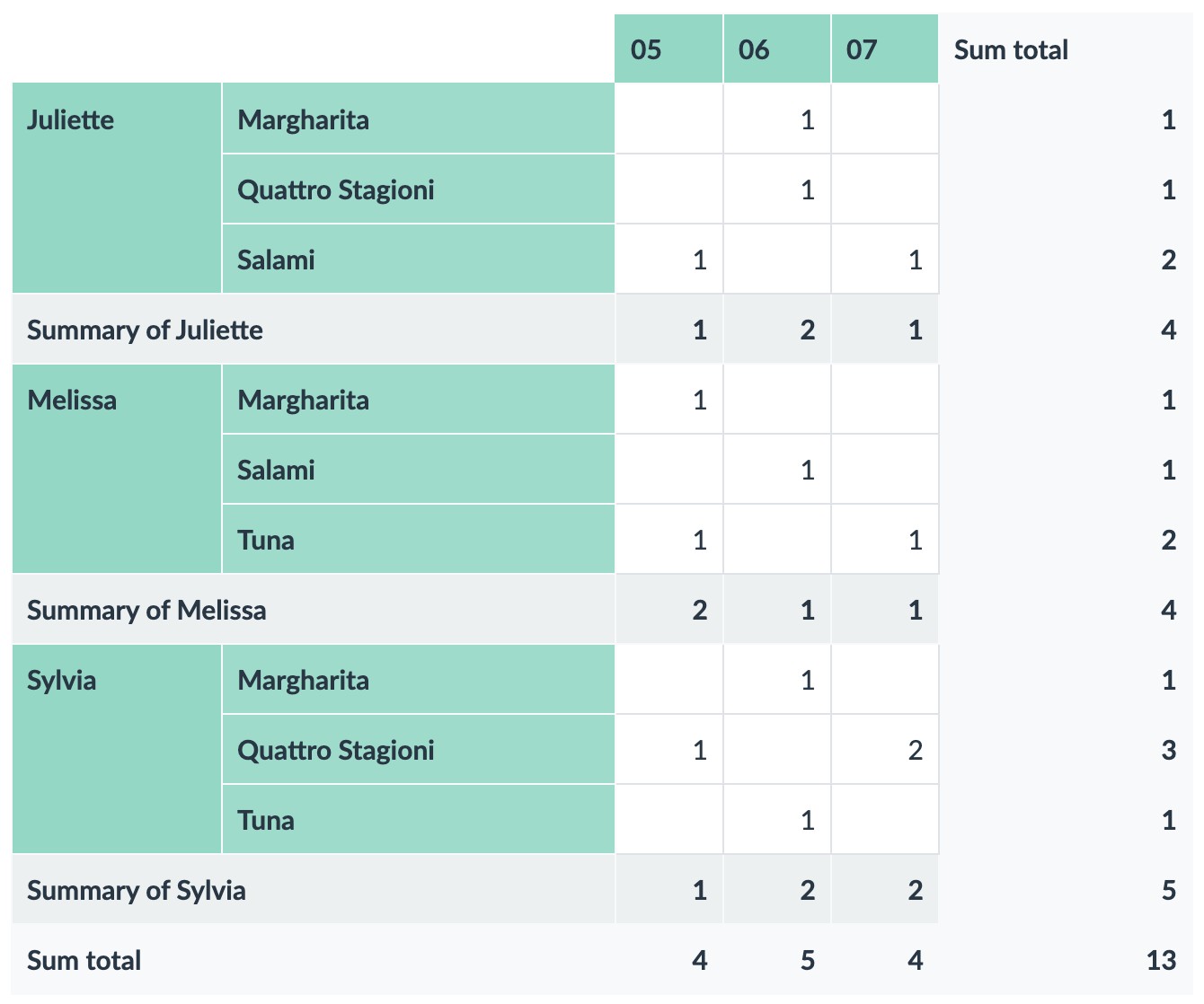
5.3. Multi-Layered Pivot Tables
For a complex analysis, combine multiple Row Labels:
| Employee | Pizza / Month | May | June | July |
|---|---|---|---|---|
| Melissa | Margherita | 1 | 0 | 0 |
| Quattro Stagioni | 0 | 0 | 0 | |
| Salami | 0 | 1 | 0 | |
| Tuna | 1 | 0 | 1 | |
| Sylvia | Margherita | 0 | 1 | 0 |
| Quattro Stagioni | 1 | 0 | 2 | |
| Salami | 0 | 0 | 0 | |
| Tuna | 0 | 1 | 0 | |
| Juliette | Margherita | 0 | 1 | 0 |
| Quattro Stagioni | 0 | 1 | 0 | |
| Salami | 1 | 0 | 1 | |
| Tuna | 0 | 0 | 0 |
5.4. Identifying Pizza Experts
To determine who is the expert at selling a specific pizza:
| Employee / Pizza | Margherita | Quattro Stagioni | Salami | Tuna |
|---|---|---|---|---|
| Melissa | 1 | 0 | 1 | 2 |
| Sylvia | 1 | 3 | 0 | 1 |
| Juliette | 1 | 1 | 2 | 0 |
Combining revenue data:
| Employee / Pizza | Margherita | Quattro Stagioni | Salami | Tuna | Grand Total |
|---|---|---|---|---|---|
| Melissa | $6.03 | 0 | $6.38 | $13.82 | $26.23 |
| Sylvia | $6.03 | $20.22 | 0 | $6.91 | $33.16 |
| Juliette | $6.03 | $6.74 | $12.76 | 0 | $25.53 |
| Grand Total | $18.09 | $26.96 | $19.14 | $20.73 | $84.92 |
This reveals that Sylvia is the Quattro Stagioni expert and generates the most revenue.
6. Ordering, Sorting, and Filtering Techniques
6.1. Sorting Options
Sorting is crucial for highlighting extreme values and trends in your pivot table.
- Sorting by Labels: Alphabetical, time-based, or value-based sorting for Row Labels and Column Labels.
- Sorting by Values: Sort rows by values in specific columns or columns by values in specific rows.
- Sorting by Grand Totals: Sort rows and columns by their respective grand totals.
6.2. Sorting Example
Let’s sort the employee pizza sales by Grand Total revenue:
| Employee / Pizza | Margherita | Quattro Stagioni | Salami | Tuna | Grand Total |
|---|---|---|---|---|---|
| Juliette | $6.03 | $6.74 | $12.76 | 0 | $25.53 |
| Melissa | $6.03 | 0 | $6.38 | $13.82 | $26.23 |
| Sylvia | $6.03 | $20.22 | 0 | $6.91 | $33.16 |
| Grand Total | $18.09 | $26.96 | $19.14 | $20.73 | $84.92 |
Sorted horizontally (←→) by the Grand Total row and vertically by the Grand Total column:
| Employee / Pizza | Margherita | Salami | Tuna | Quattro Stagioni | Grand Total |
|---|---|---|---|---|---|
| Juliette | $6.03 | $12.76 | 0 | $6.74 | $25.53 |
| Melissa | $6.03 | $6.38 | $13.82 | 0 | $26.23 |
| Sylvia | $6.03 | 0 | $6.91 | $20.22 | $33.16 |
| Grand Total | $18.09 | $19.14 | $20.73 | $26.96 | $84.92 |
Reversed sorting order:
| Employee / Pizza | Quattro Stagioni | Tuna | Salami | Margherita | Grand Total |
|---|---|---|---|---|---|
| Sylvia | $20.22 | $6.91 | 0 | $6.03 | $33.16 |
| Melissa | 0 | $13.82 | $6.38 | $6.03 | $26.23 |
| Juliette | $6.74 | 0 | $12.76 | $6.03 | $25.53 |
| Grand Total | $26.96 | $20.73 | $19.14 | $18.09 | $84.92 |
6.3. Multi-Level Sorting
With multiple Row or Column Labels, you can apply multiple sorting orders.
| Employee | Pizza / Month | May | June | July |
|---|---|---|---|---|
| Melissa | Margherita | 1 | 0 | 0 |
| Quattro Stagioni | 0 | 0 | 0 | |
| Salami | 0 | 1 | 0 | |
| Tuna | 1 | 0 | 1 | |
| Sylvia | Margherita | 0 | 1 | 0 |
| Quattro Stagioni | 1 | 0 | 2 | |
| Salami | 0 | 0 | 0 | |
| Tuna | 0 | 1 | 0 | |
| Juliette | Margherita | 0 | 1 | 0 |
| Quattro Stagioni | 0 | 1 | 0 | |
| Salami | 1 | 0 | 1 | |
| Tuna | 0 | 0 | 0 |
6.4. Filtering
Filtering involves removing data rows from the source table based on specific criteria. Filters do not change the Pivot Table itself but rather the input data.
Source table rows -> Filters -> Source table values that passed filters -> Pivot Table
7. Pivot Tables Across Different Tools
Pivot tables are available in various tools, each with its own interface and terminology.
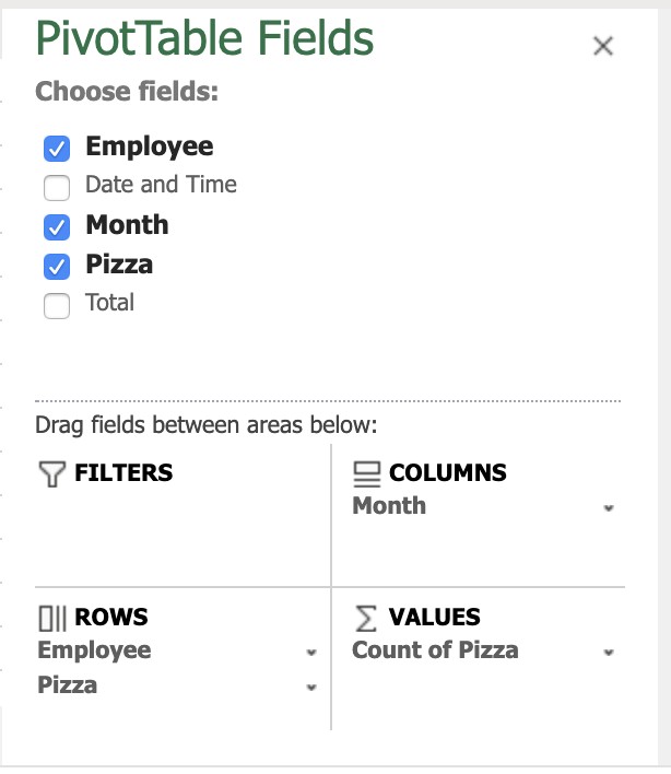
7.1. Microsoft Office 365 Excel
Excel may require an extra column for handling dates.
Key terms:
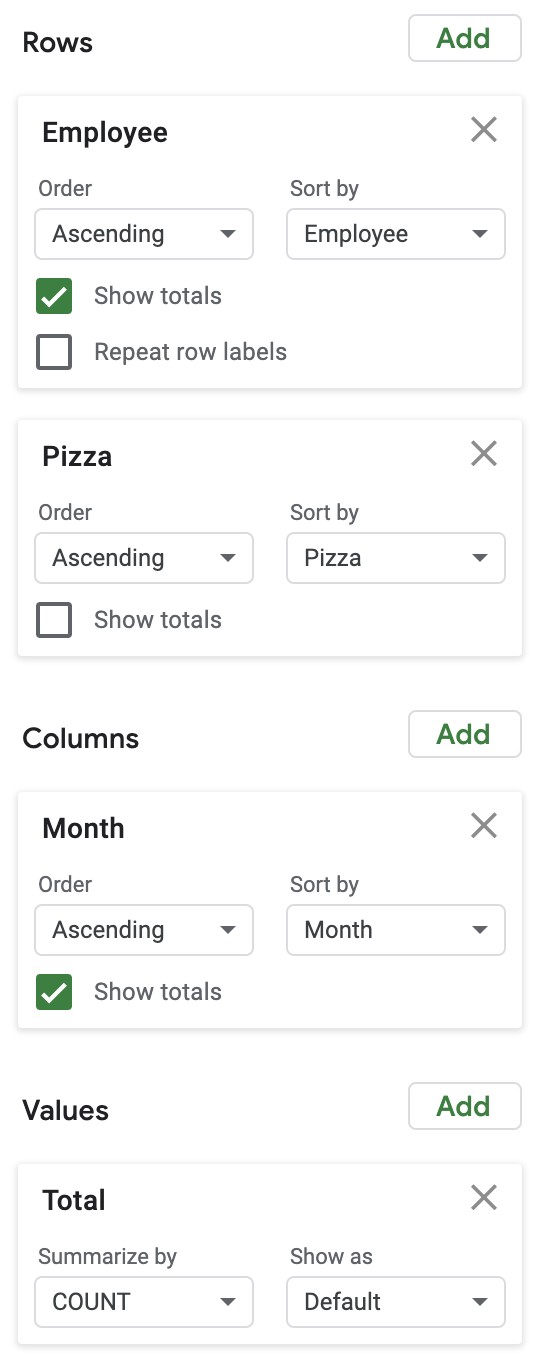
- Row Labels are under “Rows”.
- Column Labels are under “Columns”.
- Summation Values are under “Values”.
- Column names are referred to as “Fields”.
7.2. Google Sheets
Google Sheets also requires an extra column for dates, but the output is cleaner.
The terminology is the same as in Excel.
7.3. LibreOffice Calc
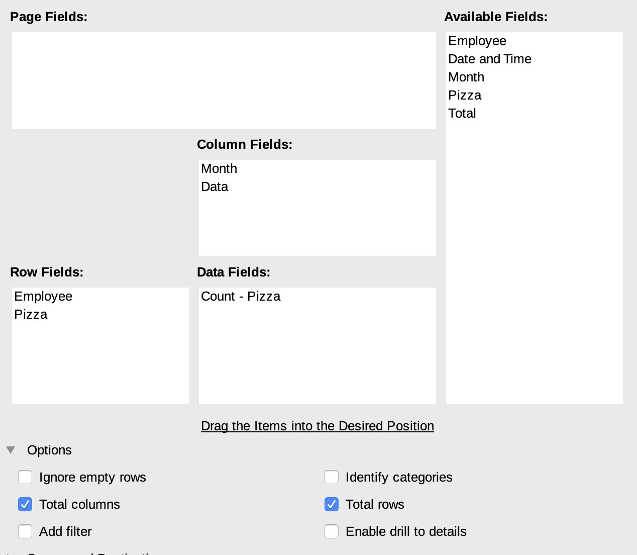
LibreOffice also needs a separate “Month” column. The terminology is different and the settings are less intuitive.
Row Labels are called “Row Fields”, Column Labels are “Column Fields”, and Summation Values are “Data Fields”.
7.4. Apple Numbers
Apple Numbers does not have a built-in pivot table function.
7.5. Lumeer
Lumeer is unique in its ability to understand dates and times naturally, eliminating the need for extra columns.
The terminology is standard: Row Labels are “Rows”, Column Labels are “Columns”, and Summation Values are “Values”.
7.6. Tool Comparison Table
| Feature | MS Office 365 | Google Sheets | Libre Office | Apple Numbers | Lumeer |
|---|---|---|---|---|---|
| Supports all necessary functions | ✅ | ✅ | ✅ | ❌ | ✅ |
| Natural understanding of date and time | ❌ | ❌ | ❌ | N/A | ✅ |
| Standardized settings terminology | ✅ | ✅ | ❌ | N/A | ✅ |
| Easily accessible settings | ✅ | ✅ | ❌ | N/A | ✅ |
| Nice output look’n’feel | ✅ | ✅ | ❌ | N/A | ✅ |
8. Further Learning Resources
To enhance your knowledge of pivot tables, here are some valuable resources:
-
Excel:
- Contextures by Debra Dalgleish: https://www.contextures.com/
- Excel! Taiwan by Wen Hsiu Liu: http://www.excel.com.tw/
- Xelplus by Leila Gharani: https://www.xelplus.com/
- Le CFO masqué by Sophie Marchand: https://www.lecfomasque.com/
-
Google Sheets:
- Pivot Tables in Google Sheets Beginners Guide by Ben L. Collins: https://www.benlcollins.com/spreadsheets/pivot-tables-google-sheets/
-
General:
- Udemy Courses: Explore a range of online courses covering pivot tables and data analysis.
9. FAQ: Pivot Tables Demystified
9.1. How do I create a pivot table from another pivot table?
While most tools allow this, it’s generally not recommended as it may indicate poor data structure. Consider using a tool like Lumeer or a database system with a Business Intelligence tool.
9.2. Are Pivot Tables dynamic?
Yes, pivot tables refresh automatically when the source data changes. To freeze a pivot table, copy and paste the values to another location.
9.3. Can I combine two Pivot Tables?
Combining pivot tables often requires a manual approach. Tools like Lumeer can overlay multiple pivot tables with the same structure.
9.4. What is a Row Label?
A Row Label groups table rows by unique values in a specific column, listed at the beginning of each row in the pivot table.
9.5. What is a Column Label?
A Column Label groups table rows by unique values in a specific column, listed at the beginning of each column in the pivot table.
9.6. What are Summation Values?
Summation Values are original table values used to calculate resulting values in the pivot table, combined using functions like sum, average, min, max, etc.
10. Conclusion: Unleash Your Data Analysis Potential with LEARNS.EDU.VN
Pivot tables are indeed easy to learn, especially with the right guidance and resources. This comprehensive guide has provided a solid foundation, equipping you with the knowledge and skills to transform raw data into actionable insights.
At LEARNS.EDU.VN, we are dedicated to empowering individuals with the knowledge and tools they need to succeed in today’s data-driven world. Whether you are a student, a professional, or simply someone curious about data analysis, we offer a wide range of resources to support your learning journey.
Ready to take your data analysis skills to the next level? Visit LEARNS.EDU.VN today to discover more insightful articles, comprehensive tutorials, and engaging courses. Unlock your potential and become a data analysis expert with LEARNS.EDU.VN!
For any inquiries or further assistance, please contact us at:
Address: 123 Education Way, Learnville, CA 90210, United States
WhatsApp: +1 555-555-1212
Website: LEARNS.EDU.VN
Empower yourself with the knowledge to excel. Start your learning journey with learns.edu.vn today!