Color theory is both a science and an art, explaining how we perceive color and its visual effects. Understanding How To Learn Color Theory will empower you to craft compelling visuals, build a strong brand identity, and effectively communicate your message. This guide, brought to you by LEARNS.EDU.VN, will provide a deep dive into color models, the color wheel, color schemes, and practical applications, enabling you to master the art of color. Explore color relationships and unlock the secrets of color perception to enhance your designs.
1. Understanding Color Foundations
Color is more than just a visual experience; it’s a powerful communication tool. Studies show that people make subconscious judgments about an environment or product within 90 seconds of initial viewing, and that between 62% and 90% of that assessment is based on color alone. Understanding the foundations of color is essential for anyone looking to leverage its power, whether in marketing, design, or art.
1.1. Color Perception
Color perception begins when light reflects off an object and enters our eyes. The light stimulates photoreceptor cells called cones, which are sensitive to different wavelengths of light, corresponding to red, green, and blue. The signals from these cones are then processed by the brain, which interprets the combination of wavelengths as a specific color. This is a subjective experience that can vary slightly from person to person due to differences in cone sensitivity and neural processing.
The human eye can distinguish millions of different colors, but it’s important to understand that color is not an inherent property of objects. Instead, it is the result of how our brains interpret the light that is reflected or emitted by them.
1.2. Additive vs. Subtractive Color Models
There are two primary color models: additive (RGB) and subtractive (CMYK). Understanding the difference between these models is crucial for working with color in different mediums.
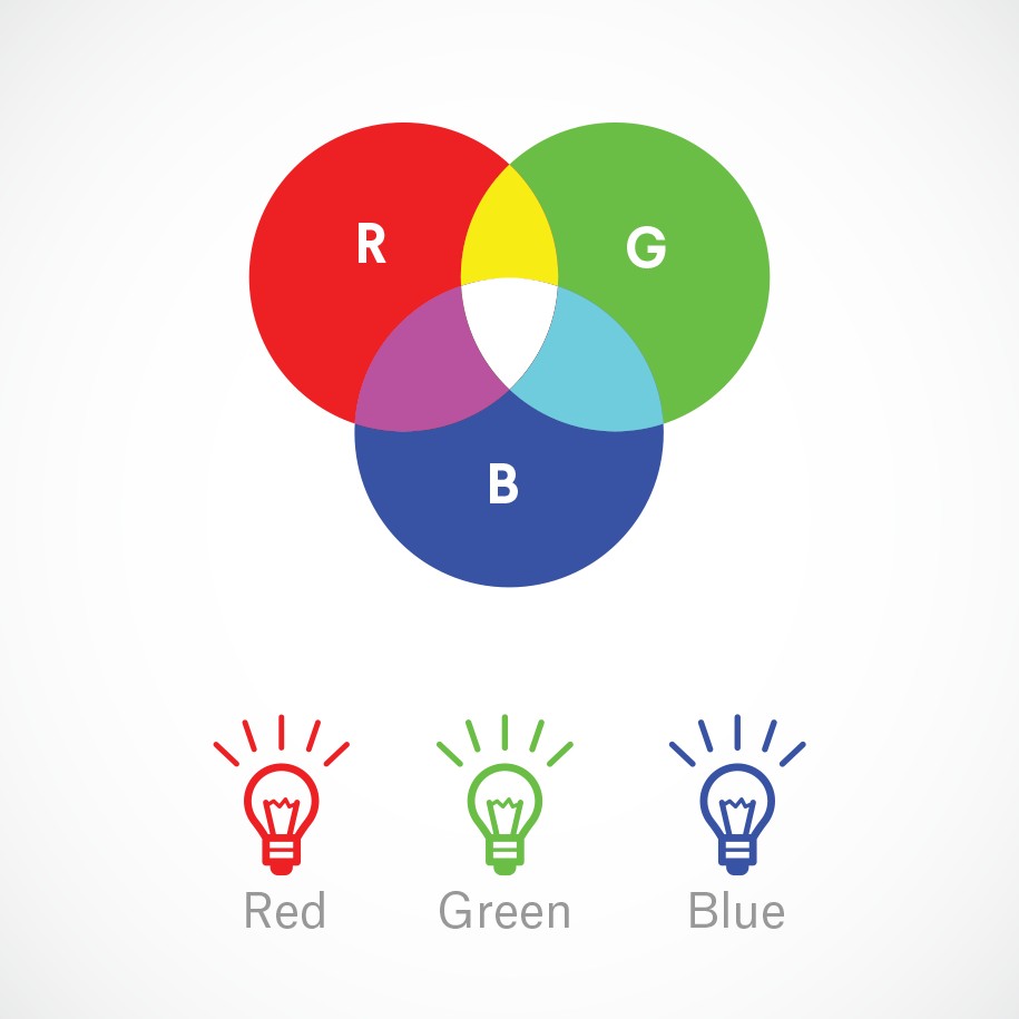
1.2.1. RGB: The Additive Color Mixing Model
The RGB color model is used for digital displays such as TVs, computer screens, and smartphones. It involves mixing red, green, and blue light to create a wide range of colors. In the additive model, the more light you add, the brighter the color becomes. When all three primary colors are combined at full intensity, they produce white light.
1.2.1.1. Why Should You Care About RGB?
If you are working with digital media, such as websites, social media graphics, or video, it is essential to use the RGB color model to ensure that your colors appear accurately. Using the wrong color model can result in colors that look dull or distorted.
For instance, if you have a vibrant yellow logo and you display it on a website using the CMYK color model, it will likely appear muddy and less appealing. Ensuring your digital files are in RGB will maintain the vibrancy and accuracy of your brand colors.
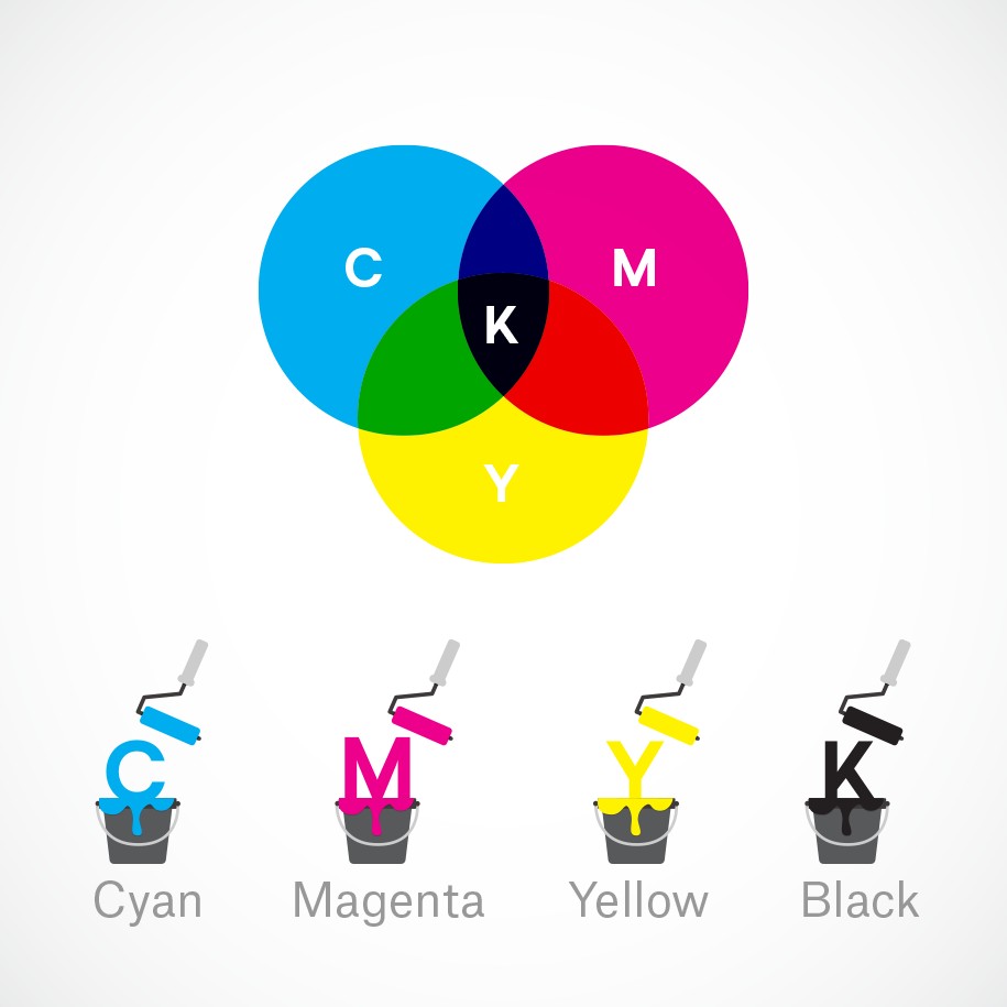
1.2.2. CMYK: The Subtractive Color Mixing Model
The CMYK color model is used for printing. It involves mixing cyan, magenta, yellow, and key (black) inks to create colors on a physical surface. In the subtractive model, the more ink you add, the darker the color becomes. When all four colors are combined at full intensity, they produce black.
1.2.2.1. Why Should You Care About CMYK?
If you are printing marketing materials such as brochures, posters, or packaging, it is essential to use the CMYK color model to ensure accurate color reproduction. Using the RGB color model for printing can result in colors that look different from what you see on your screen, leading to disappointing results and wasted money.
For example, if you design a full-color brochure in RGB and send it to a printer, the colors may not come out as expected. To avoid this, always convert your files to CMYK before printing.
Table 1: RGB vs CMYK Color Models
| Feature | RGB (Additive) | CMYK (Subtractive) |
|---|---|---|
| Application | Digital displays (screens) | Printing |
| Primary Colors | Red, Green, Blue | Cyan, Magenta, Yellow, Key (Black) |
| Color Creation | Mixing light | Mixing inks |
| Color Intensity | Adding more light makes it brighter | Adding more ink makes it darker |
| White Creation | All colors at full intensity | Absence of all colors |
| Black Creation | Absence of all colors | All colors at full intensity |


2. Decoding the Color Wheel
The color wheel, a foundational tool in color theory, was invented by Sir Isaac Newton in 1666. It is used by artists and designers to create color harmonies, understand color relationships, and mix colors effectively. Mastering the color wheel is essential for anyone seeking to create visually appealing and balanced designs.
2.1. Primary, Secondary, and Tertiary Colors
The color wheel is composed of three main categories of colors: primary, secondary, and tertiary.
- Primary Colors: These are the three basic colors—red, yellow, and blue—that cannot be created by mixing other colors. They form the foundation of the color wheel.
- Secondary Colors: These colors are created by mixing two primary colors. The secondary colors are green (yellow + blue), orange (red + yellow), and purple (red + blue).
- Tertiary Colors: These colors are created by mixing a primary color with a secondary color. Examples of tertiary colors include red-orange, yellow-orange, yellow-green, blue-green, blue-violet, and red-violet.
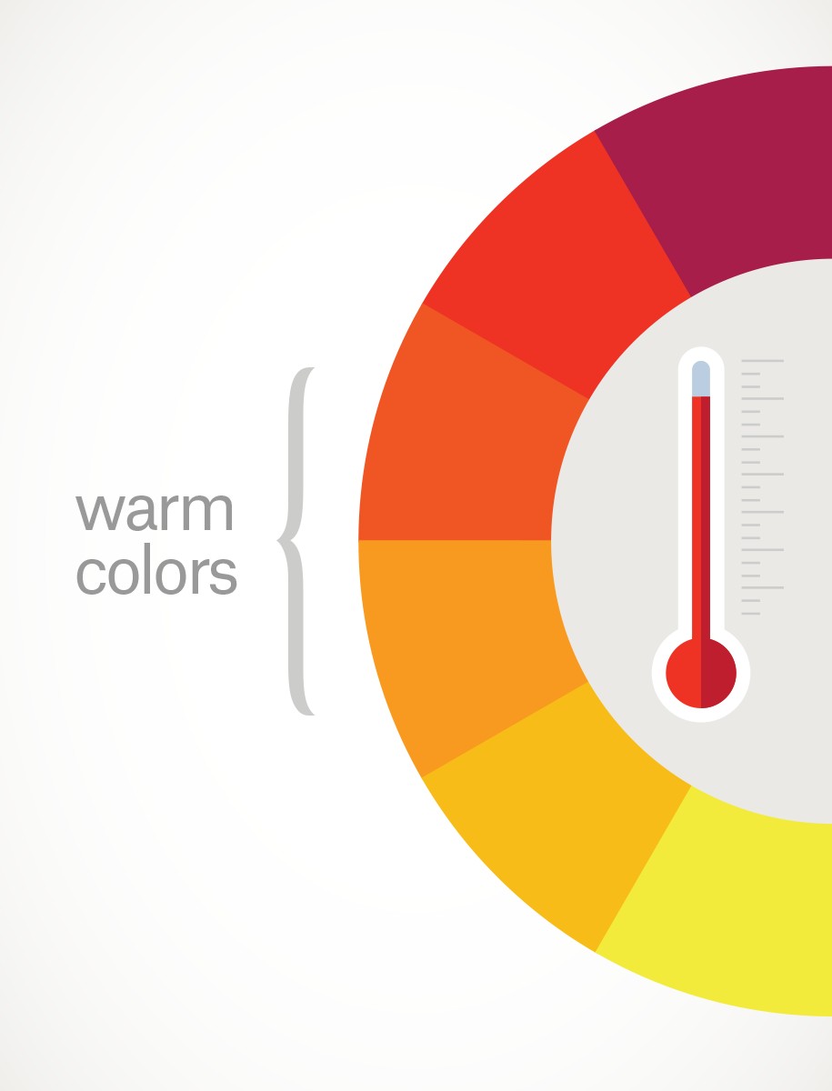
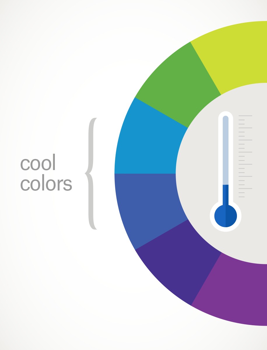
2.2. Warm vs. Cool Colors
The color wheel can be divided into warm and cool colors, each associated with different emotions and effects.
- Warm Colors: These include reds, oranges, and yellows. They are often associated with energy, excitement, and passion. Warm colors tend to be attention-grabbing and can evoke feelings of warmth and comfort.
- Cool Colors: These include blues, greens, and purples. They are often associated with calmness, peace, and serenity. Cool colors can create a sense of tranquility and are often used to convey professionalism and trust.
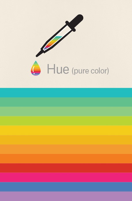
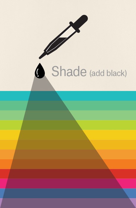
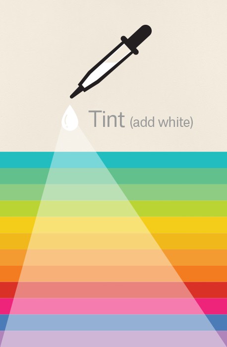
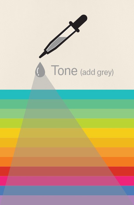
2.3. Hue, Shade, Tint, and Tone
Understanding hue, shade, tint, and tone is essential for creating variations of colors and achieving specific visual effects.
- Hue: This is the pure color as it appears on the color wheel, such as red, blue, or green.
- Shade: This is a hue to which black has been added, making the color darker. For example, adding black to red creates burgundy.
- Tint: This is a hue to which white has been added, making the color lighter. For example, adding white to red creates pink.
- Tone: This is a hue to which gray has been added, making the color more muted. Adding gray to red creates a dusty rose color.
Table 2: Color Variations
| Term | Definition | Example | Effect |
|---|---|---|---|
| Hue | The pure color as it appears on the wheel | Red | Foundation of color variations |
| Shade | Hue + Black | Burgundy | Darker, richer color |
| Tint | Hue + White | Pink | Lighter, softer color |
| Tone | Hue + Gray | Dusty Rose | Muted, less intense color |
3. Exploring Color Schemes
Color schemes are systematic ways of using the color wheel to create harmonious and visually appealing color combinations. Understanding different color schemes can help you make informed decisions about color choices in your designs.
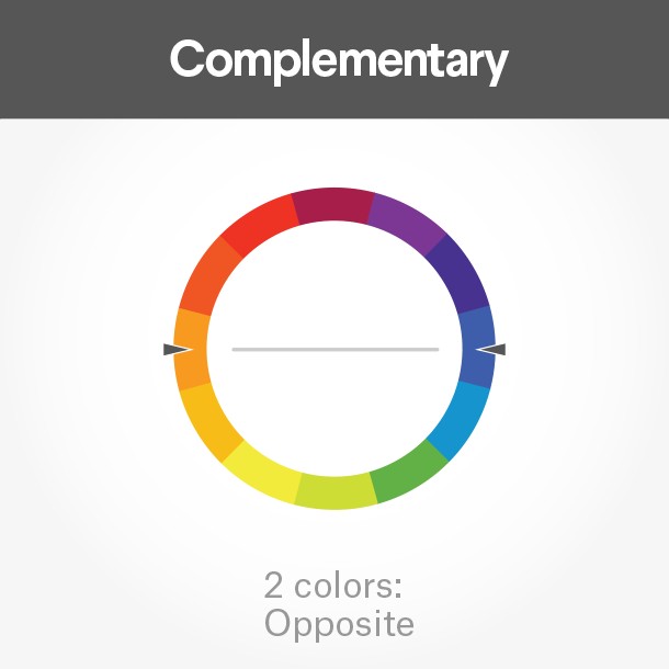
3.1. Complementary Colors
Complementary colors are located opposite each other on the color wheel, such as red and green, or blue and orange. They create a high contrast and can make elements stand out.
3.1.1. Example of Complementary Colors in Branding
Pepper Powered, a food company, uses a complementary color scheme in its logo, combining red and green to create a visually striking and memorable brand identity.
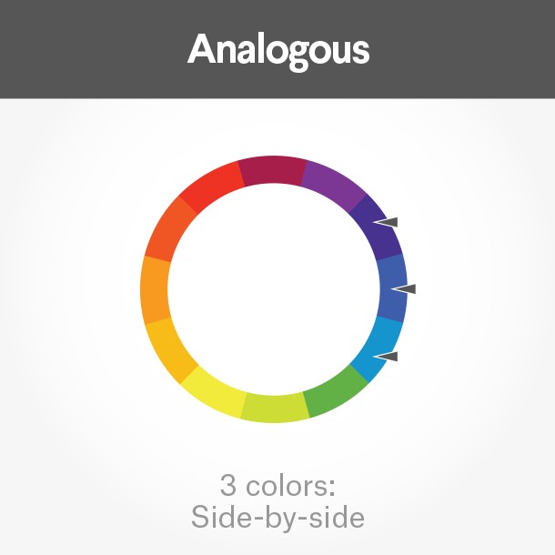
3.2. Analogous Colors
Analogous colors are located next to each other on the color wheel, such as red, orange, and yellow. They create a harmonious and soothing effect.
3.2.1. Example of Analogous Colors in Web Design
The Tostitos website uses an analogous color scheme, with bright orange, yellow, and red hues. The bright orange navigation bar draws the eye to explore the site, while the accent-colored links at the bottom direct hungry consumers to “Buy Online.”
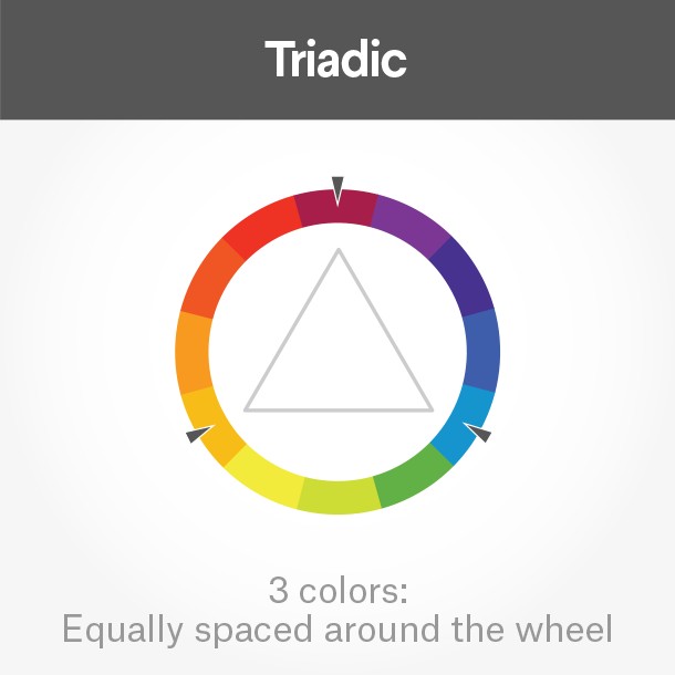
3.3. Triadic Colors
Triadic colors are evenly spaced around the color wheel, such as red, blue, and yellow. They create a vibrant and dynamic effect.
3.3.1. Example of Triadic Colors in Branding
Burger King uses a triadic color scheme effectively in its branding, with red, blue, and yellow creating a visually appealing and memorable brand identity.
Table 3: Common Color Schemes
| Color Scheme | Description | Visual Effect |
|---|---|---|
| Complementary | Colors opposite each other on the wheel | High contrast, elements stand out |
| Analogous | Colors next to each other on the wheel | Harmonious, soothing |
| Triadic | Colors evenly spaced around the wheel | Vibrant, dynamic |
| Monochromatic | Uses variations of a single hue | Unified, calming |
| Square | Uses four colors equally spaced around the wheel | Bold, vibrant |
| Rectangle (Tetradic) | Uses two complementary pairs | Rich, versatile |
4. The Significance of Color Theory
Color theory is essential for branding, marketing, and sales. It helps you make informed decisions about color choices, ensuring that your brand stands out and appeals to your target audience.
4.1. Branding and Marketing
Understanding color theory can guide you in making effective branding decisions, such as choosing the right colors for your logo, website, and marketing materials. Color evokes emotions and associations, and choosing the right colors can help you communicate your brand’s personality and values.
For instance, blue is often associated with dependability and trust, making it a popular choice for financial institutions and healthcare companies. Green is often associated with nature and health, making it a good choice for eco-friendly brands and wellness companies.
4.2. Color Psychology in Web Design
The psychology of color plays a significant role in web design. Colors can influence user behavior, affect conversion rates, and impact the overall user experience. Choosing the right colors for your website can help you create a positive and engaging experience for your visitors.
For example, using bright and vibrant colors for call-to-action buttons can encourage users to click and take action. Using calming and soothing colors for the background can create a relaxed and inviting atmosphere.
4.3. Analyzing Competitor Color Choices
Knowledge of color theory can also help you better understand what your competition is doing. By analyzing the color choices of your competitors, you can identify opportunities to differentiate your brand and stand out in the market.
For example, if all of your competitors are using blue in their branding, you might consider using a different color, such as orange or yellow, to make your brand more noticeable.
Table 4: Color Associations and Their Uses
| Color | Associations | Common Uses |
|---|---|---|
| Blue | Trust, dependability, calmness | Financial institutions, healthcare, tech companies |
| Green | Nature, health, growth | Eco-friendly brands, wellness companies, agriculture |
| Red | Energy, passion, excitement | Food industry, sports, entertainment |
| Yellow | Happiness, optimism, creativity | Education, children’s products, hospitality |
| Orange | Enthusiasm, warmth, affordability | Technology, energy, food |
| Purple | Luxury, royalty, wisdom | Beauty, spirituality, high-end products |
| Black | Sophistication, power, elegance | Luxury brands, fashion, technology |
| White | Purity, cleanliness, simplicity | Healthcare, technology, minimalist designs |
4.4. Examples of Color Theory in Practice
4.4.1. Law Firm Web Pages
In a side-by-side comparison of three law firm web pages, you’ll notice a variety of analogous color schemes. Blue is generally associated with dependability, brown with masculinity, and yellow with competence and happiness. All of these are positive associations in a field that stereotypically has negative connotations, such as dishonesty or aggression.
5. Advanced Color Concepts and Techniques
Once you grasp the fundamentals of color theory, delving into more advanced concepts can significantly enhance your ability to create impactful and sophisticated designs. These advanced techniques focus on understanding how colors interact in complex ways and how to use them effectively in various contexts.
5.1. Color Harmony and Contrast
5.1.1. Understanding Harmony
Color harmony refers to the pleasing arrangement of colors that creates a sense of balance and visual appeal. Achieving harmony involves selecting colors that work well together, often based on their relationships on the color wheel. Complementary, analogous, and triadic color schemes are all examples of harmonious color combinations.
5.1.2. Using Contrast Effectively
Contrast is the difference in visual properties that makes an object distinguishable from others. In color theory, contrast can be achieved through differences in hue, saturation, and brightness. High contrast can make elements stand out, while low contrast creates a more subtle effect. Understanding how to balance harmony and contrast is essential for creating visually engaging designs.
5.2. Color Context and Perception
5.2.1. Impact of Context
Color perception is highly dependent on context. The colors surrounding a particular color can influence how it is perceived. This phenomenon is known as simultaneous contrast. For example, a gray patch will appear lighter against a dark background and darker against a light background.
5.2.2. Adapting to Different Mediums
Different mediums, such as print and digital displays, render colors differently. Understanding these differences is crucial for ensuring that your colors look consistent across all platforms. Print uses the CMYK color model, while digital displays use the RGB color model. Converting colors between these models can sometimes result in slight variations, so it is essential to preview your designs in the intended medium.
5.3. Mastering Color Psychology
5.3.1. Deep Dive into Emotional Impact
Color psychology is the study of how colors affect human behavior and emotions. Different colors evoke different feelings and associations. For example, blue is often associated with trust and reliability, while red is associated with excitement and energy. Mastering color psychology involves understanding these associations and using them strategically to influence the audience’s perception.
5.3.2. Cultural Color Associations
Color associations can vary significantly across cultures. For example, white is often associated with purity and weddings in Western cultures, while in some Eastern cultures, it is associated with mourning. Being aware of these cultural differences is essential for designing for a global audience.
Table 5: Advanced Color Techniques
| Technique | Description | Application |
|---|---|---|
| Color Harmony | Pleasing arrangement of colors that creates balance and visual appeal | Creating balanced and visually appealing designs |
| Color Contrast | Difference in visual properties that makes an object distinguishable | Making elements stand out and creating visual interest |
| Color Context | How surrounding colors influence the perception of a particular color | Adjusting colors based on the background and surrounding elements |
| Medium Adaptation | Understanding how different mediums render colors differently | Ensuring colors look consistent across print and digital platforms |
| Color Psychology | Study of how colors affect human behavior and emotions | Influencing the audience’s perception and evoking desired emotions |
| Cultural Awareness | Being aware of cultural differences in color associations | Designing for a global audience and avoiding unintended cultural offense |
5.4. Tools and Resources for Color Theory
To further enhance your understanding and application of color theory, numerous tools and resources are available. These tools can help you experiment with color schemes, analyze color palettes, and stay updated with the latest trends.
5.4.1. Digital Color Tools
Digital color tools, such as Adobe Color, Coolors, and Paletton, allow you to create and explore color schemes. These tools offer features such as color wheel exploration, palette generation from images, and accessibility checks to ensure your designs are inclusive.
5.4.2. Educational Resources
Online courses, tutorials, and books provide in-depth knowledge of color theory. Platforms like Coursera, Udemy, and Skillshare offer courses taught by industry experts. Additionally, books like “Interaction of Color” by Josef Albers and “Color and Light” by James Gurney are valuable resources for understanding color.
5.4.3. Community and Inspiration
Engaging with design communities and seeking inspiration from various sources can broaden your understanding of color theory. Platforms like Dribbble, Behance, and Pinterest showcase the work of designers worldwide, providing a wealth of inspiration for your own projects.
6. Practical Exercises to Master Color Theory
Theory is crucial, but practice solidifies your understanding. Here are some practical exercises to hone your color skills.
6.1. Color Wheel Challenge
Create your own color wheel using paints or digital tools. Start with the primary colors and mix them to create secondary and tertiary colors. This exercise will help you understand the relationships between colors and how they are created.
6.2. Color Scheme Exploration
Choose an image or design and analyze its color scheme. Identify the primary, secondary, and accent colors. Determine whether the color scheme is complementary, analogous, triadic, or another type. Experiment with different color schemes to see how they affect the overall look and feel of the design.
6.3. Branding Project
Create a brand identity for a fictional company. Choose a name, logo, and color palette. Consider the emotions and associations you want to evoke with your brand and select colors accordingly. Develop marketing materials, such as a website and social media graphics, using your chosen color palette.
6.4. Color Journal
Keep a color journal and document the colors you see in your everyday life. Note the emotions and associations that each color evokes. Analyze how colors are used in different contexts, such as advertising, fashion, and interior design.
Table 6: Exercises for Mastering Color Theory
| Exercise | Description | Learning Outcome |
|---|---|---|
| Color Wheel Challenge | Create your own color wheel using paints or digital tools | Understand the relationships between colors and how they are created |
| Color Scheme Exploration | Analyze the color scheme of an existing image or design | Identify primary, secondary, and accent colors and understand different color scheme types |
| Branding Project | Create a brand identity for a fictional company, including logo and color palette | Apply color psychology and branding principles to create a cohesive and effective brand identity |
| Color Journal | Document and analyze the colors you see in your everyday life | Develop a deeper understanding of color associations and how colors are used in different contexts |
| Redesign Challenge | Redesign an existing website or marketing material using a different color scheme | See firsthand how color affects the overall look, feel, and effectiveness of a design |
| Color Mood Board Creation | Create a mood board for a specific emotion or theme using relevant colors and imagery | Connect colors to specific emotions and understand how they can be used to evoke desired feelings in design |
7. The Future of Color Theory in Design and Technology
As technology advances, color theory continues to evolve, influencing design and user experiences in innovative ways. Staying current with these trends is essential for designers and marketers alike.
7.1. Dynamic Color Palettes
Dynamic color palettes adapt to user preferences, environmental conditions, or the content being displayed. These palettes use algorithms to adjust colors in real-time, creating a personalized and engaging experience. For example, a website might adjust its color scheme based on the user’s location or time of day.
7.2. Accessibility and Inclusive Design
Accessibility is becoming increasingly important in design. Color theory plays a crucial role in creating designs that are accessible to people with visual impairments. Tools and guidelines are available to help designers choose color combinations that provide sufficient contrast and readability.
7.3. Augmented Reality (AR) and Virtual Reality (VR)
AR and VR technologies are creating new opportunities for color theory. Designers can use color to create immersive and realistic experiences in virtual environments. Understanding how color affects depth perception and spatial awareness is essential for designing effective AR and VR applications.
Table 7: The Future of Color Theory
| Trend | Description | Impact on Design |
|---|---|---|
| Dynamic Color Palettes | Color palettes that adapt to user preferences or environmental conditions | Personalized and engaging user experiences |
| Accessibility | Designing with accessibility in mind for users with visual impairments | Inclusive and user-friendly designs |
| AR/VR Applications | Using color to create immersive and realistic experiences in virtual environments | Enhanced depth perception and spatial awareness in AR/VR applications |
| AI-Driven Color Analysis | Utilizing AI to analyze color trends and predict user preferences | Data-driven color choices that maximize engagement and effectiveness |
| Sustainable Color Choices | Using eco-friendly dyes and pigments in design | Environmentally responsible designs that minimize impact on the planet |
7.4. AI-Driven Color Analysis
Artificial intelligence (AI) is being used to analyze color trends and predict user preferences. AI algorithms can analyze vast amounts of data to identify the most effective color combinations for different contexts. This technology can help designers make data-driven decisions and create designs that are more likely to resonate with their target audience.
8. Overcoming Challenges in Learning Color Theory
Learning color theory can be challenging, but with the right approach, you can overcome common obstacles and develop a strong understanding of color.
8.1. Identifying Common Mistakes
One common mistake is relying too heavily on personal preferences without considering the principles of color theory. Another mistake is using too many colors in a design, which can create a cluttered and overwhelming effect. Avoid these pitfalls by grounding your color choices in theoretical principles and by practicing restraint in your color palettes.
8.2. Seeking Feedback and Iteration
Feedback from peers and mentors can provide valuable insights and help you identify areas for improvement. Be open to constructive criticism and use it to refine your color choices. Iteration is a key part of the design process, so don’t be afraid to experiment and try new things.
8.3. Staying Patient and Persistent
Learning color theory takes time and effort. Don’t get discouraged if you don’t see results immediately. Stay patient and persistent, and continue to practice and experiment. Over time, you will develop a strong understanding of color and be able to use it effectively in your designs.
Table 8: Overcoming Challenges in Color Theory
| Challenge | Solution | Benefit |
|---|---|---|
| Over-Reliance on Preference | Ground color choices in theoretical principles | Objective and effective color choices |
| Too Many Colors | Practice restraint and limit color palettes | Clean, balanced, and visually appealing designs |
| Lack of Feedback | Seek constructive criticism from peers and mentors | Identification of areas for improvement and refinement of color choices |
| Impatience | Stay persistent and continue to practice and experiment | Gradual development of a strong understanding of color and effective use in designs |
| Difficulty Understanding | Break down complex concepts into smaller, manageable parts; use visual aids and examples | Improved comprehension and ability to apply color theory principles effectively |
| Cultural Misinterpretation | Research cultural color associations and consult with cultural experts | Avoidance of unintended cultural offense and creation of culturally sensitive designs |
9. Resources at LEARNS.EDU.VN for Mastering Color Theory
At LEARNS.EDU.VN, we are dedicated to providing comprehensive and accessible educational resources to help you master color theory. We offer a variety of courses, articles, and tools to support your learning journey.
9.1. Comprehensive Courses
Our comprehensive courses cover all aspects of color theory, from the basics to advanced techniques. These courses are taught by experienced instructors and include hands-on exercises and real-world examples.
9.2. Detailed Articles and Tutorials
Our detailed articles and tutorials provide in-depth explanations of key color theory concepts. These resources are designed to be easy to understand and accessible to learners of all levels.
9.3. Interactive Tools and Resources
We offer a range of interactive tools and resources to help you experiment with color schemes and create visually appealing designs. These tools include color palette generators, accessibility checkers, and design templates.
Table 9: Resources at LEARNS.EDU.VN
| Resource | Description | Benefit |
|---|---|---|
| Comprehensive Courses | Courses covering all aspects of color theory, from basics to advanced techniques | Structured learning with experienced instructors and hands-on exercises |
| Detailed Articles/Tutorials | In-depth explanations of key color theory concepts, easy to understand | Comprehensive understanding of color theory principles and applications |
| Interactive Tools | Color palette generators, accessibility checkers, and design templates | Practical application of color theory and creation of visually appealing designs |
| Community Forum | Platform for students to discuss, share work, and receive feedback | Collaborative learning environment and peer support |
| Expert Webinars | Live sessions with color theory experts and designers | Opportunities to learn from professionals, ask questions, and stay updated with industry trends |
| Downloadable Guides | Checklists, cheat sheets, and guides for quick reference and practical application | Quick access to essential information and practical guidance for applying color theory principles |
10. FAQ: Frequently Asked Questions About Color Theory
To help clarify any remaining questions, here are some frequently asked questions about color theory:
-
What is color theory?
Color theory is both the science and art of using color. It explains how humans perceive color and the visual effects of how colors mix, match, or contrast with each other. -
Why is color theory important?
Color theory is important because it helps you create visually appealing and effective designs. Understanding color theory can improve your branding, marketing, and sales efforts. -
What are the primary colors?
The primary colors are red, yellow, and blue. These colors cannot be created by mixing other colors. -
What are the secondary colors?
The secondary colors are green, orange, and purple. These colors are created by mixing two primary colors. -
What is a color scheme?
A color scheme is a systematic way of using the color wheel to create harmonious and visually appealing color combinations. -
What are complementary colors?
Complementary colors are located opposite each other on the color wheel, such as red and green. -
What are analogous colors?
Analogous colors are located next to each other on the color wheel, such as red, orange, and yellow. -
How does color affect branding?
Color evokes emotions and associations, and choosing the right colors can help you communicate your brand’s personality and values. -
How can I improve my understanding of color theory?
You can improve your understanding of color theory by studying the principles, practicing with color, and seeking feedback from others. -
What resources are available to learn color theory?
Numerous resources are available to learn color theory, including books, online courses, tutorials, and interactive tools. LEARNS.EDU.VN offers a variety of resources to help you master color theory.
Color theory is a powerful tool that can enhance your designs, improve your branding, and increase your sales. By understanding the principles of color theory and practicing with color, you can unlock your creative potential and create visually stunning and effective designs.
Ready to dive deeper into the world of color? Visit LEARNS.EDU.VN today to explore our comprehensive courses, detailed articles, and interactive tools. Unleash your creativity and master the art of color with LEARNS.EDU.VN. For more information, contact us at 123 Education Way, Learnville, CA 90210, United States. Reach us on Whatsapp at +1 555-555-1212. Start your color journey today at learns.edu.vn!