In the realm of web design and user experience (UX), the call to action (CTA) button is a pivotal element. It serves as a prompt, guiding users towards desired actions within a webpage. Among the various types of CTA buttons, the “Learn More” button holds a unique position. It’s often used to encourage users to delve deeper into a topic, product, or service without demanding an immediate commitment. This article will explore the art of crafting effective “Learn More” buttons, examining design techniques and showcasing examples that resonate with English-speaking audiences and boost engagement.
Best Practices for Designing Effective “Learn More” Buttons
Integrating “Learn More” buttons effectively requires careful planning and consideration within your website’s architecture. They should be strategically placed and designed to capture user attention and smoothly guide them through their journey. Let’s delve into some essential design techniques for “Learn More” buttons.
Leverage Size to Emphasize Importance
In web design, size is a powerful visual cue. Larger elements naturally draw more attention, signaling importance to the user. When it comes to “Learn More” buttons, consider their significance in the user flow and size them accordingly.
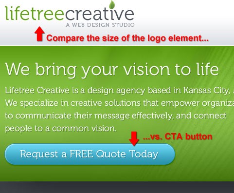
Relative Size of “Learn More” Buttons
Look at Lifetree Creative’s website. Their “Learn More” button is noticeably larger than the company logo, despite the logo being positioned higher on the page. This deliberate size difference ensures that the “Learn More” button immediately captures the visitor’s eye, highlighting its importance in guiding user interaction.
Differentiating Importance with Varying Button Sizes
Webpages often feature multiple calls to action. To establish a visual hierarchy and guide user attention, utilize varying button sizes. paramore|redd exemplifies this by making their newsletter signup button significantly larger than the “continue reading” buttons. This clearly signals that subscribing to the newsletter is the prioritized action on this particular page, effectively using size to guide user behavior.
Strategic Positioning for Maximum Visibility
The placement of “Learn More” buttons is crucial for ensuring user visibility. Prominent positions, especially in the upper sections of a webpage, significantly increase the likelihood of users noticing and interacting with the button, leading to higher engagement and potential conversions.
“Learn More” Buttons in Distinguished Areas
Placing a “Learn More” button in a visually distinct area is a highly effective strategy. dailymile demonstrates this by positioning their “Learn More” button seemingly above other page elements, like the bar graph graphic. This elevated placement creates a sense of prominence, drawing the eye and making the button stand out within the layout.
Top-of-Page Placement for Immediate Impact
Consider the “Post a Job!” CTA on the Your Web Job website, located in the top right corner. While not a “Learn More” button, the principle of top-of-page placement is highly relevant. Positioning a “Learn More” button in a similar prominent area ensures immediate visibility. Even if users initially explore other content, the button’s placement ensures they remember and can easily locate it when ready to delve deeper.
Centering “Learn More” Buttons for Focus
Positioning a “Learn More” button in the center of a layout, especially with minimal flanking elements, is another effective way to capture attention. PicsEngine uses this technique. Despite the button’s color not having a high contrast with the background, its centered placement alone effectively draws the user’s eye and encourages interaction.
Utilize Whitespace for Visual Separation
Whitespace, or negative space, is a powerful design tool. Surrounding a “Learn More” button with whitespace can significantly enhance its prominence, particularly in visually busy areas of a webpage.
Whitespace to Highlight “Learn More” Buttons
IconDock perfectly illustrates the effectiveness of whitespace. Even with a simple and relatively small “Learn More” button design, it stands out due to the generous whitespace separating it from surrounding elements. This isolation draws the eye and emphasizes the button’s importance.
Varying Whitespace to Indicate Logical Connections
The amount of whitespace can also communicate relationships between elements. Less whitespace implies a stronger connection. For “Learn More” buttons, consider grouping them visually with supporting text or elements that provide context or encourage user action.
Donor Tools provides a good example. They reduce whitespace between the text explaining the benefits of signing up and the “Sign Up” CTA button, visually grouping these related elements. In contrast, increased whitespace separates this group from a browser screenshot, preventing visual distraction and keeping focus on the primary call to action. This principle applies to “Learn More” buttons when you want to connect them with introductory text or related information.
Employ High-Contrast Colors for Visibility
Color choice is paramount for “Learn More” buttons. Opt for colors that offer high contrast against the background and surrounding elements. This contrast is vital for grabbing user attention and ensuring the button is easily noticed amidst other webpage content.
Color Contrast Against Surrounding Elements
Notepod effectively uses color contrast. Their “Learn More” button is a bright blue, starkly contrasting with the surrounding black elements. This deliberate color choice immediately draws the user’s eye to the button, making it impossible to miss.
Background and Foreground Color Contrast
Valley Creek Church uses a bright yellow “Learn More” button against a grayscale image. This stark contrast, even against a complex visual element like a photo, ensures the “Learn More” button remains highly visible and easily actionable. This demonstrates that even simple “Learn More” button designs can be highly effective with strategic color choices.
Offer “Learn More” as a Secondary Action
Webpages often present multiple calls to action. Sometimes, providing a secondary action, such as a “Learn More” button, can be crucial for nurturing user interest before they commit to a primary action. For instance, before a user signs up for a service, they may need more information. “Learn More” buttons can lead to product tours or pages with detailed information, facilitating informed decision-making.
“Learn More” Buttons Beside Primary Actions
OfficeVP displays two CTA buttons side-by-side: a primary signup button and a secondary “Learn More” (Take a Tour) button. Color differentiation clearly indicates these distinct options. Users can choose to sign up directly (primary action) or opt to “Learn More” by taking a tour first (secondary action), catering to different user readiness levels.
Transmissions also employs this strategy, placing a “Learn More” (Download) option next to the primary “Purchase” button. The primary action is visually emphasized with higher color contrast. The “Learn More” button serves as a less commitment-heavy alternative, acknowledging that some users prefer to try before buying. The reduced whitespace between the buttons groups them logically, further guiding user choices.
“Learn More” Buttons Stacked Below Primary Actions
Alternatively, secondary actions like “Learn More” can be positioned below primary CTAs for greater visual separation. Virb demonstrates this, placing the “Join Now” button above the “Take a Tour” (Learn More) button. The muted color of the secondary action further distinguishes it and reinforces the primary action’s prominence. This stacked approach can be useful when visual hierarchy and clear separation are desired.
Ensure Clarity and Context in “Learn More” Button Text
While visual design is critical, the text within a “Learn More” button is equally important. It should clearly communicate what users can expect when they click. Generic “Learn More” text is a good starting point, but consider adding context or specificity to enhance user understanding and encourage clicks.
Tell Users What They Will Learn
Instead of just “Learn More,” consider using text that hints at the value proposition. For example:
- “Learn More About Our Services”
- “Learn More About Pricing”
- “Learn More and Get Started”
- “Learn More – Watch a Demo”
This added context manages user expectations and can increase click-through rates by assuring them that clicking the button will lead to relevant and valuable information.
Design Showcase of Effective “Learn More” Buttons
Having explored best practices, let’s examine real-world examples of effective “Learn More” button implementations and how they align with these techniques.
Campaign Monitor presents two clear options: “Try it for free” (primary) and “View features” (Learn More/secondary). This caters to users at different stages of the decision-making process, offering both immediate action and further exploration.
Fileshare HQ utilizes “Learn More” text that provides a benefit-driven promise: “start sharing files in minutes.” This adds a compelling reason to click and learn more, highlighting the ease and speed of their service.
Livestream.com uses vertically stacked CTAs, with “Get an Estimate” as the primary, followed by “Learn More About Plans.” This structured approach guides users through a logical information flow, starting with a high-level action and then offering deeper dives.
Hambo Design uses a “Learn More” button with reassuring text: “Get a Quote – No Strings Attached.” This addresses potential user concerns about commitment and encourages them to learn more without fear of unwanted obligations.
The Resumator effectively combines whitespace, size, and color to make their “Learn More” (Take a tour) button prominent. They also logically group it with supporting feature text and position it below the primary action (“See Pricing”), creating a clear visual hierarchy.
Wufoo presents two horizontally arranged, prominent buttons. While not explicitly “Learn More,” the example illustrates clear, large, and easily noticeable CTAs that guide user action without being visually overwhelming.
Mobile Web Design places a “Purchase the book” CTA prominently and provides context by immediately following it with text explaining the cost and available formats. While not a “Learn More” button, the contextual text is a valuable lesson applicable to enhancing “Learn More” buttons – clarify what users will learn more about.
Alt text: Mobile Web Design website illustrating a prominent “Purchase the book” call to action button followed by contextual text detailing cost and formats, highlighting the importance of providing clear information alongside call to actions.
NCover stacks their CTAs, prioritizing the primary action above a muted blue secondary action (“Take a Tour” – Learn More). Whitespace effectively groups related elements, creating a cohesive visual unit that draws attention.
Xero uses a “Find out more” (Learn More) text link as a secondary action beside their primary CTA. This provides a less intrusive option for users who aren’t ready to commit immediately, encouraging further exploration.
The Invoice Machine uses similarly styled “Learn More” (Product Tour) and “Sign Up” buttons, suggesting equal importance. This approach might be used when a product tour is considered crucial for user conversion, prioritizing the “Learn More” pathway.
Ekklesia 360 uses “Learn More” buttons with forward-pointing arrow icons, visually suggesting progression and further information. High-contrast colors against a dark background ensure prominence.
Checkout demonstrates that even when surrounded by larger elements, a prominently colored “Learn More” button can still effectively capture user attention due to strong color contrast.
Alt text: Checkout website showcasing a prominently colored “Learn More” button effectively capturing user attention despite being surrounded by larger visual elements, demonstrating the power of color contrast.
spinen uses clear and direct language in their “Learn More” button, explicitly stating “find out more about our product,” leaving no ambiguity about the button’s purpose.
Codebase combines high-contrast color, an icon, and ample whitespace to draw attention to their “Learn More” button, which clearly states the benefit: “Free 15 Day Trial.” This combination of visual and textual cues maximizes user engagement.
Alt text: Codebase website showcasing a “Learn More” button that effectively uses high-contrast color, an icon, and whitespace to attract attention, while clearly stating the benefit of a “Free 15 Day Trial.”
GoodBarry uses whitespace, size, and strategic color choices to make their “Learn More” button highly noticeable. Emphasizing “FREE” in the button text further incentivizes clicks by addressing potential cost concerns.
Wake Interactive demonstrates that even with limited whitespace, strong color contrast between a “Learn More” button and its surroundings can make it pop.
Alt text: Wake Interactive website demonstrating that strong color contrast between a “Learn More” button and its surroundings can ensure visibility even with limited surrounding whitespace.
OH! Media showcases a “Learn More” button that truly stands out due to its position, generous whitespace, and striking color choice. The button becomes the focal point of the page.
Alt text: OH! Media website highlighting a “Learn More” button that effectively commands attention through strategic positioning, generous whitespace, and a striking color choice, making it the clear focal point of the page.
Pixelcrayons exemplifies how whitespace alone can significantly enhance the visual prominence of a “Learn More” button, even with a relatively simple design.
Alt text: Pixelcrayons website demonstrating how whitespace alone can dramatically increase the visual prominence of a “Learn More” button, even with a simple and understated design.
Ballpark uses a large “Learn More” button with clear and direct language, telling users exactly what to expect when they click. Size and clarity combine for effective communication.
Alt text: Ballpark website showcasing a large “Learn More” button with clear and direct language, effectively communicating user expectations and leveraging size for visual impact.
Scrapblog combines prominent color, sufficient whitespace, and relative size to attract user attention to their “Learn More” button. Straightforward language emphasizes ease of use (“start right now”).
Alt text: Scrapblog website demonstrating the combined effect of prominent color, ample whitespace, and relative size in making a “Learn More” button highly attention-grabbing, complemented by straightforward language emphasizing ease of use.
13 Creative shows that even unconventional button designs can draw attention, even when surrounded by proportionally larger elements. Creativity can be a powerful tool for making “Learn More” buttons stand out.
Alt text: 13 Creative website showcasing an unconventional “Learn More” button design that effectively draws attention even when surrounded by larger elements, highlighting the power of creative design in call to action effectiveness.
Kalculator uses “Learn More” text to manage user expectations about pricing, stating “$3.99 only.” This proactive approach can increase conversions by addressing potential cost concerns upfront.
Alt text: Kalculator website demonstrating the use of “Learn More” button text to manage user expectations about pricing by stating “$3.99 only,” proactively addressing potential cost concerns and encouraging conversions.
Web Design Beach uses differently colored CTAs, with “get a quote” (primary) being more prominent than the secondary “learn more” options. Color hierarchy effectively guides user attention to the desired primary action.
Alt text: Web Design Beach website showcasing differently colored call to actions, with a more prominent “get a quote” (primary) button and less emphasized “learn more” (secondary) options, effectively using color hierarchy to guide user attention.
The Highland Fling uses whitespace, prominent positioning, and an icon to make their “Learn More” button noticeable. The word “now” adds a sense of urgency, encouraging immediate action.
Alt text: The Highland Fling website demonstrating the use of whitespace, prominent positioning, and an icon to enhance the visibility of their “Learn More” button, while incorporating the word “now” to create a sense of urgency.
Commercial IQ combines size, prominent placement, and a magnifying glass icon to draw attention to their “Learn More” button. “Free to search” text addresses potential user questions about cost.
Alt text: Commercial IQ website showcasing a “Learn More” button that effectively combines size, prominent placement, and a magnifying glass icon to attract user attention, along with “Free to search” text addressing potential cost concerns.
dashboard uses high-contrast color to make their “Learn More” button stand out, even among significantly larger page elements. Color remains a powerful tool for visual prominence.
Alt text: Dashboard website demonstrating the effective use of high-contrast color to make a “Learn More” button stand out visually, even amongst significantly larger page elements, highlighting the enduring power of color in call to action design.
Conclusion
The “Learn More” button, when thoughtfully designed and strategically placed, is a valuable asset in web design. By applying the best practices discussed – leveraging size, strategic placement, whitespace, color contrast, and clear button text – you can craft “Learn More” buttons that effectively capture user attention, encourage exploration, and ultimately contribute to higher engagement and conversion rates. Remember to always prioritize user experience and clarity when designing these crucial interactive elements on your website.